Do Americans Remember Famous Food Brands?
Does branding stick?
It's common to have a go-to grocery item based on its taste, reliability, aesthetic appeal or familiarity. Brands are constantly fighting for the attention of consumers by tweaking their advertising campaigns—whether that be by investing in a multi-million dollar campaign, or changing their logo for a more modern appeal, building trust is worth the spend to these big brands.
We surveyed 8,000 Americans to find out what brand logos resonate best with consumers, and what plays a role in the decision-making process when at the grocery store.
To truly understand what logos are remembered best, we redesigned and altered eight logos based on three factors: color, font and design. Read through our study to find out what brand logos were most recognizable to American consumers of all ages.
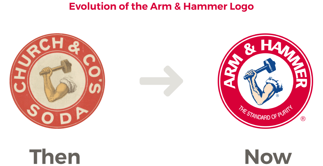
Arm & Hammer
With over 50 uses for baking soda, Arm & Hammer is easily one of the most well known kitchen and household items. Baking soda sold at a rapid pace when women were full-time homemakers, but as women's role in society evolved, home baking decreased and so did Arm & Hammer's role in the kitchen. To stay relevant, they continued to develop uses for their bicarbonate soda from toothpaste to cat litter, and with that, came changes to the logo.
The Arm & Hammer logo has evolved to keep up with product changes and new uses for baking soda, but let's not forget where the brand started in 1867. Below shows the difference between the logo's start to how you now find it in the grocery aisle.
Arm & Hammer is easily recognizable for its bright red logo and muscular arm raising a hammer. This iconic American brand is well recognized, but changes in font and small design tweaks like facing the arm and the hammer in an opposite direction added variety in the responses.
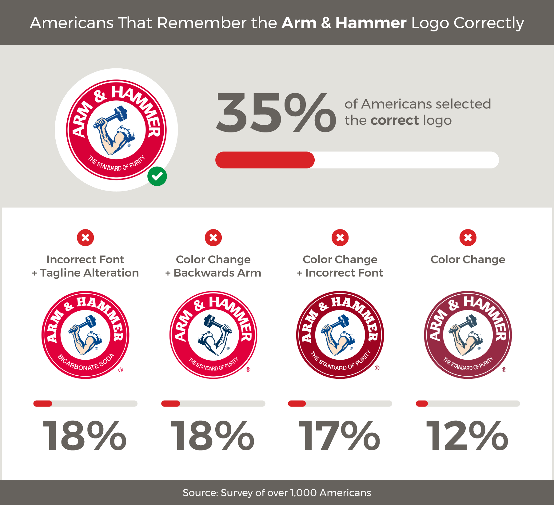
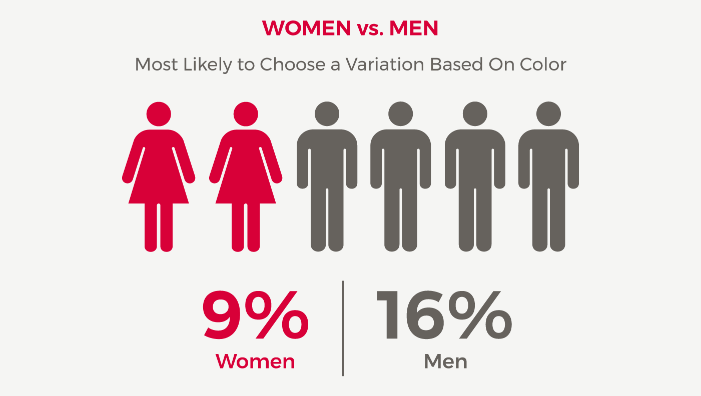
Breaking down the demographics, we found that men were more likely than women to choose a variation based on color. Additionally, surveyees ages 35 to 44 were more likely to recognize a combination of the color and font variation over other age groups.
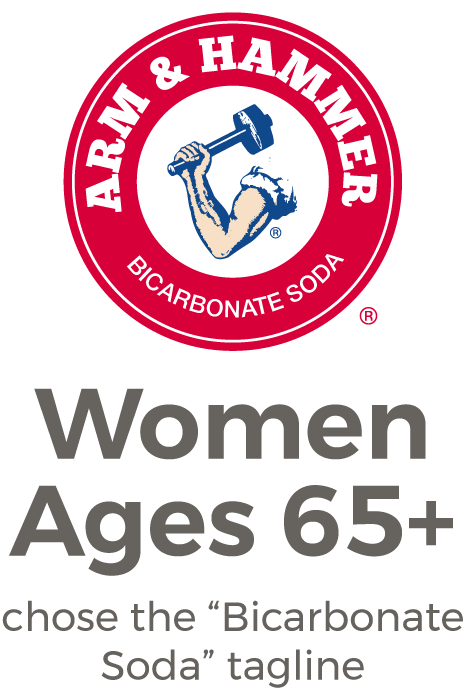
Interestingly enough, women born prior to 1953 were more likely to remember Arm & Hammer as a baking soda product choosing the tagline that read "Bicarbonate soda" instead of "Standard of Purity."
Could it be the hundreds of thousands of likes on Facebook or simply the fact that Americans have been seeing the Arm & Hammer logo floating around their kitchens since childhood that make this such a recognizable brand? With a variety of uses and strong national presence, it's no wonder that the majority of Americans, regardless of demographic, were able to differentiate the correct logo despite the variations we presented.
Chicken of the Sea
The phrase "Chicken of the Sea," was first devised by fishermen as a way to describe the taste of albacore tuna. It was so successful in helping people recognize the brand that it didn't take long to become the company name. Over the years, Chicken of the Sea has changed hands, moved shores and revamped its look, but it's still what comes to mind when people think of canned tuna.
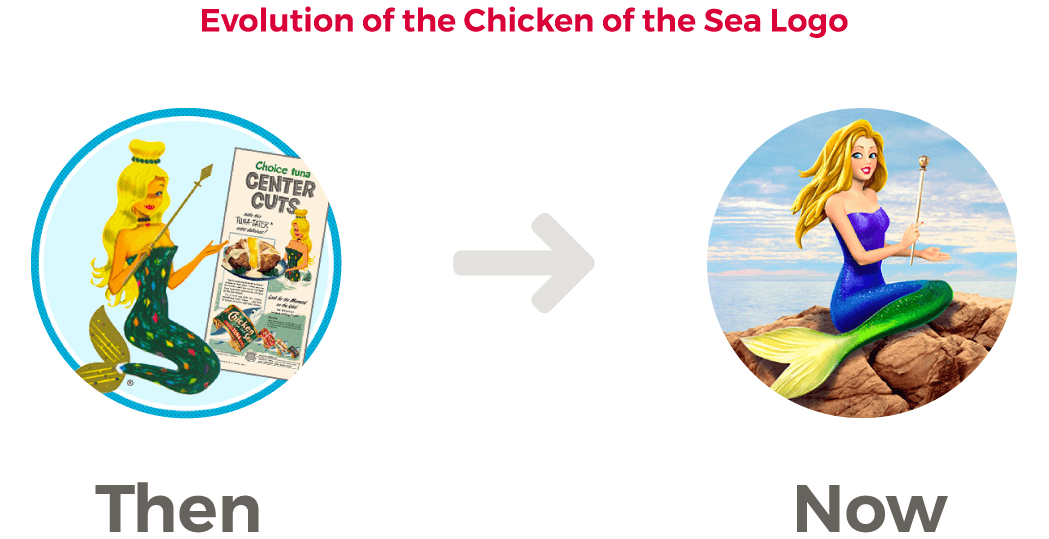
Chicken of the Sea started with a plain text logo, but added a blonde mermaid waving her wand in 1952, which is still a consistent feature of the logo today. When most people think of Chicken of the Sea, she is the first image that comes to mind, which is likely what the company planned to increase brand awareness.
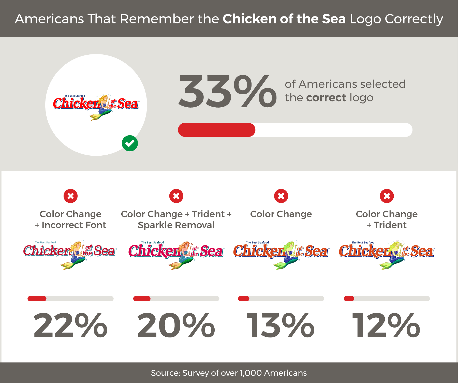
Despite the mermaid's new looks over the years, our respondents largely remembered her for how she appears today, with one-third of surveyees choosing the correct option. Of those individuals, 22 percent remembered the mermaid perfectly, but chose a different option in color and style of font.
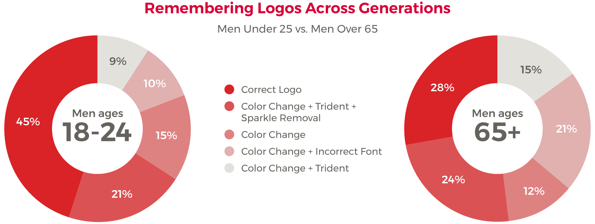
On average, millennials were most likely to choose the correct logo at 40 percent compared to 27 percent of Baby Boomers and older generations who chose correctly. This was especially noticeable in the male demographic, where older men chose the variations that depicted our alternative logos with changes in font, colors or design details of the mermaid.
Women's responses had less discrepancy compared to the male individuals surveyed. The graphs below show how age played a role in men's responses and what logo details were remembered most for each age group.
Despite so much change in appearance, the majority of Americans remember Chicken of the Sea for the friendly mermaid. Perhaps the catchy jingle "Ask any mermaid you happen to see, what's the best tuna...Chicken of the Sea" or the "Mermaid on a Rock" commercials have made sure this brands logo doesn't go forgotten.
French's
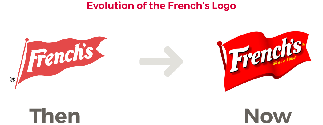
As a leader among mustards, French's is most commonly known as a hot dog staple found in backyard barbecues and ballparks. A brand originally known for mustard has evolved over the years to include must-have condiments such as Worcestershire sauce, ketchup and crispy fried onions, but regardless of product options, its bright red pennant against a yellow background is how most Americans identify mustard.
With various condiment additions since the beginning of French's business, only slight variations have been made to the logo over the years. The original came about in 1904 with only a couple minor changes since including the shortened flag pole and waving appearance of the pennant.
For a favorite mustard, it was surprising that most Americans missed the mark mistaking alterations in the design detail for the correct logo. However, if you look back at the evolution of the logo, perhaps it can be easy to see where our slight alterations in design detail and font would be confusing.
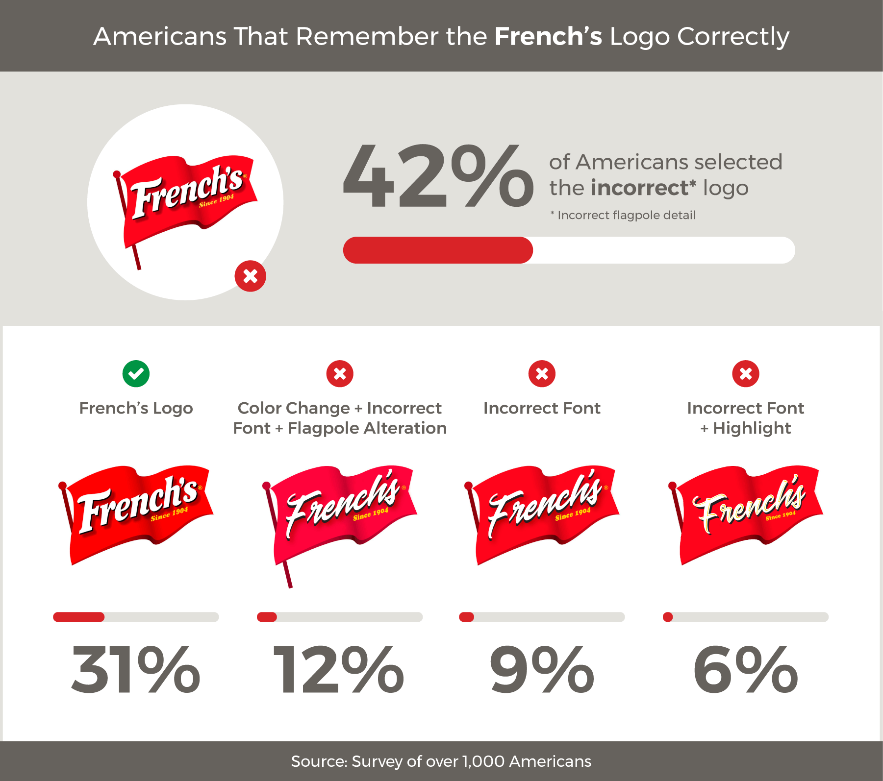
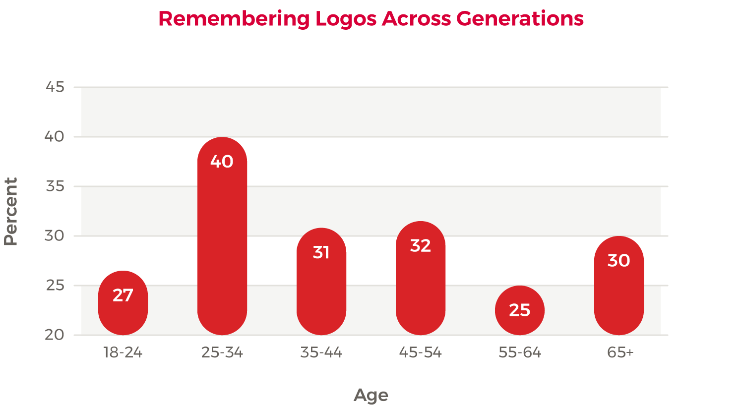
At 34 percent, women were more likely to choose the correct logo compared to the 28 percent of male respondents. However, neither gender wins this round since both groups mistakenly chose our redesign with the extended flagpole at 40 percent and 44 percent. The most individuals to correctly choose the French's logo actually appeared in the 24-34 age group.
Since its debut at the at the St. Louis World's Fair in 1904, French's Classic Yellow Mustard has been love at first bite for many. With over half a million likes on Facebook, this hot dog staple with is waving red banner is more than just a condiment—it's an American icon, and only the slightest of altered details seemed to convince people to choose the incorrect logo.
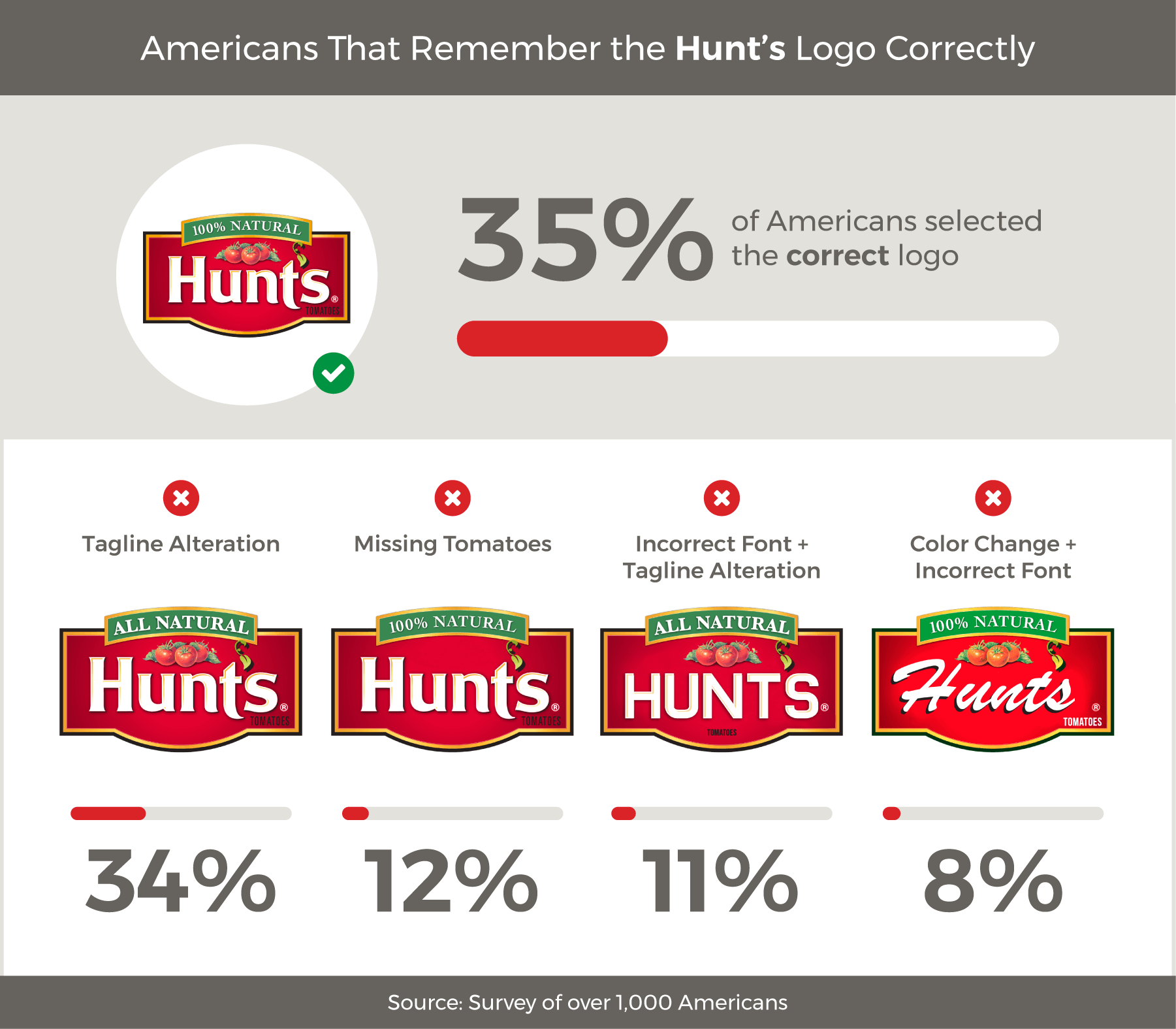
Hunt's
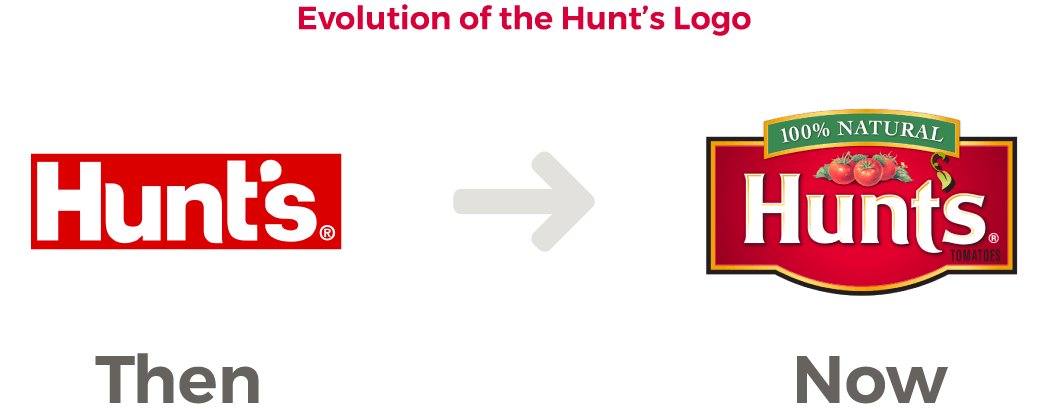
The Hunt's brand appears on a variety of tomato products, barbecue sauce, canned potatoes and peaches. Originally founded in 1888 as the Hunt Bros. Fruit Packing Co., the company has changed hands, names and logos several times. With so much evolution over the life of a single brand, we were interested to see what people remembered most about the logo: design detail, font or color.
For most Americans, what comes to mind is some variety of a red logo when they think of Hunt's. Over the years, it has changed from soley a bottle of ketchup with the text, "Hunt's," to include detailed graphics of juicy tomatoes and statements about natural products.
Our survey showed it was nearly a toss up between the real logo with a banner that reads "100% Natural" our altered design saying "All Natural." A minor change in design detail, but it was enough to stump 34 percent of surveyees. Interestingly enough, Hunt's has made a variety of statements over the years about natural and Non-GMO tomatoes making our redesigns understandably confusing.
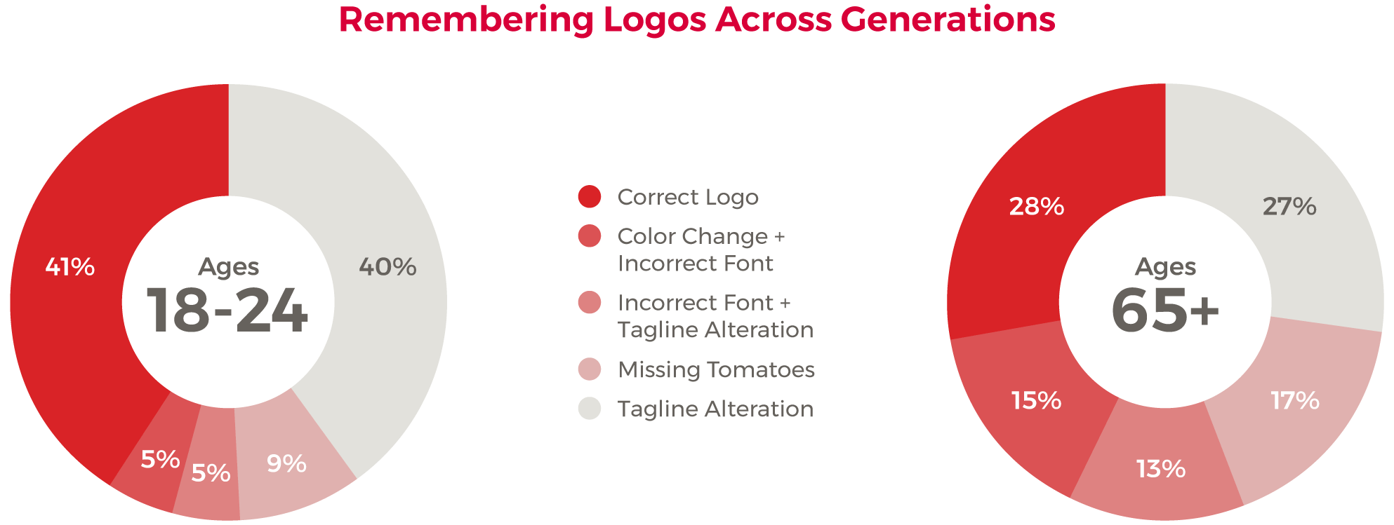
Comparing the responses between 18-24 year olds with those 65 and older, we see a greater variation in the responses with millennials surpassing older generations in choosing the correct logo.
Turns out that branding does stick, but in the case of Hunt's not by a landslide. Since they haven't fully committed to a statement that defines their products, it's understandable to see where consumers would mix up "100% Natural" and "All Natural."
Jif
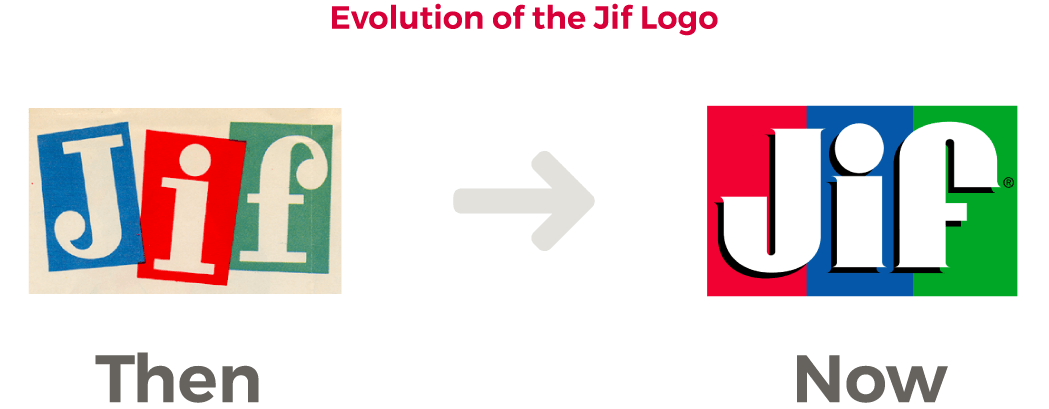
Jif has held the spot as the leading brand of peanut butter in America since 1981. Moms and kids love it and many households in America remember the brand for it's catchy slogan, "Choosy moms choose Jif." Over the years, Jif, owned by the J.M. Smucker Company, has brought on several new products, but not much has changed with its notorious red, blue and green logo.
Jif's logo has changed a grand total of one time. In the ‘80s, the company moved the original logo depicting the image of a bouncing kangaroo and disjointed letters to the text, "Jif" against its notorious color coordinated background. No extra fluff with this logo, the peanut butter speaks for itself.
It's no surprise that as one of the most loved household brands, the majority of individuals surveyed were able to differentiate the correct logo from its redesigned counterparts regardless of changes in color order and slight design tweaks. Of all the redesigned logos in our survey, Jif was the most memorable.
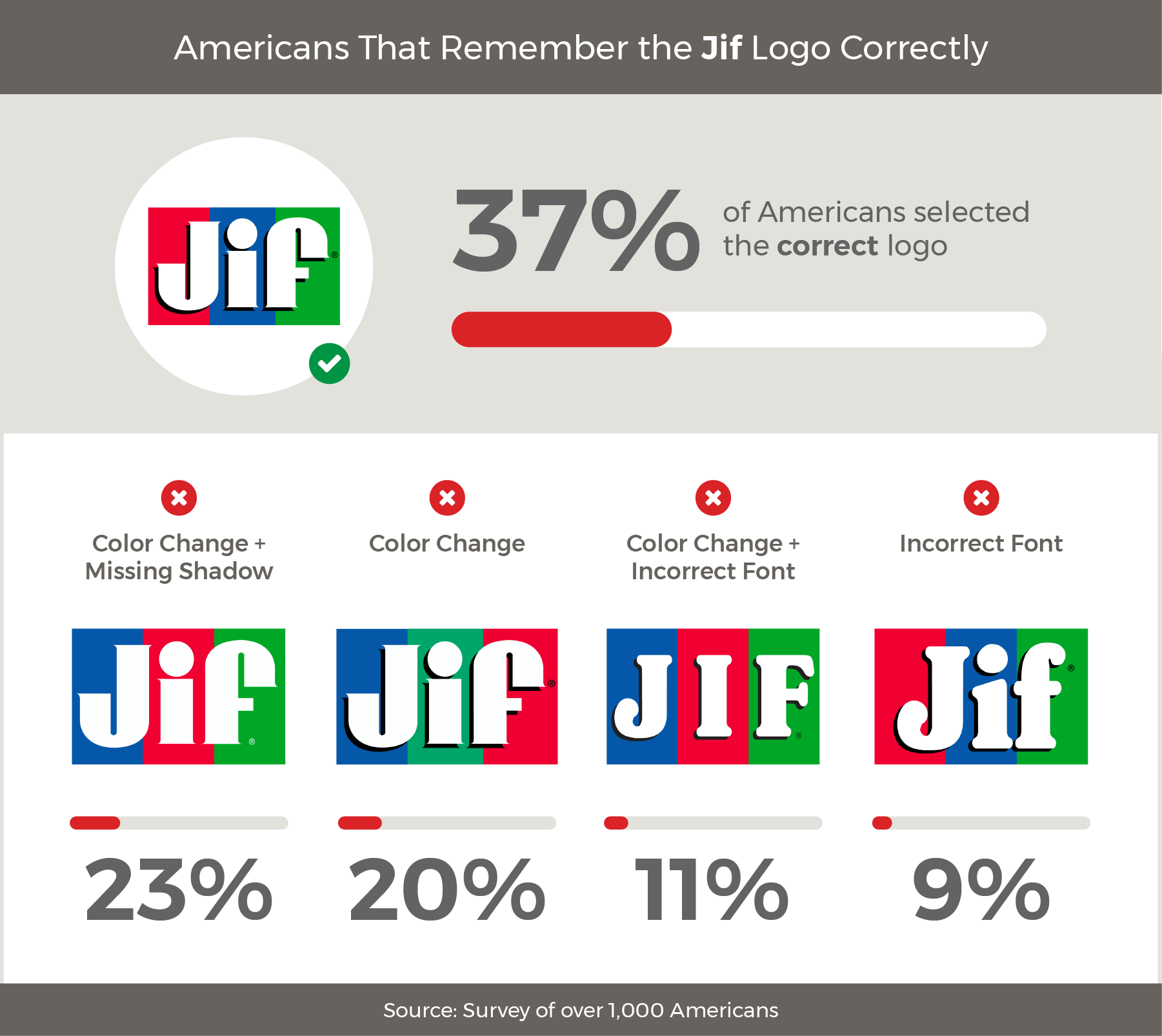
Millennials, both men and women, remember Jif better than any other age group with roughly 50 percent recognizing the correct logo compared to the older generations at an average of 32 percent.
Perhaps it's growing up with Jif commercials, singing the catchy jingle or consistently seeing the logo in the pantry that makes this brand so recognizable. It is simple yet effective and when compared to its redesigned counterparts, the original logo was the most commonly recognized.
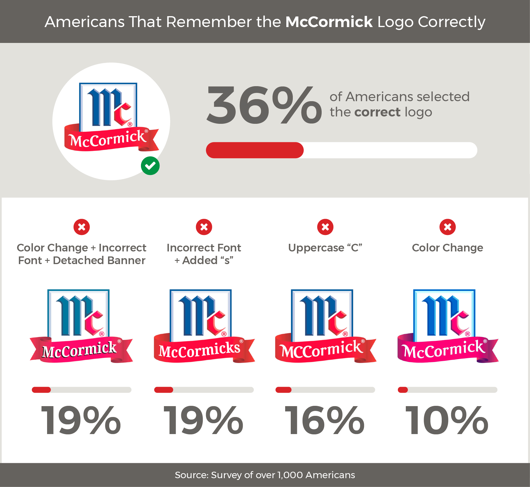
McCormick
McCormick is best known for its flavors with nearly every kitchen cabinet in America holding at least one of their spice variations. From herbs to salts, food coloring and extracts, this brand covers nearly everything needed to make even the most boring meal taste good, so we were curious to learn what was most memorable about a logo that's a staple in daily cooking.
"Mc," has always been a prominent feature of McCormick products. Over the company's lifetime, it has evolved, moving positions and establishing a more edgy look. As the company progressed and expanded, so did its logo achieving the perfect look nearly 40 years ago.
Through the ‘80s, McCormick was easily recognizable for its red, white and blue rectangular spice cans emblazoned with the large "Mc" logo; that is until the company moved to small plastic bottles. A smaller surface area reduced to a smaller logo, but based on the individuals we surveyed, we found that size isn't taken into account when it comes to recognition. The correct logo won this round followed by options with variations in font and minor design details including an elongated tail on the McCormick banner.
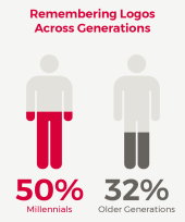
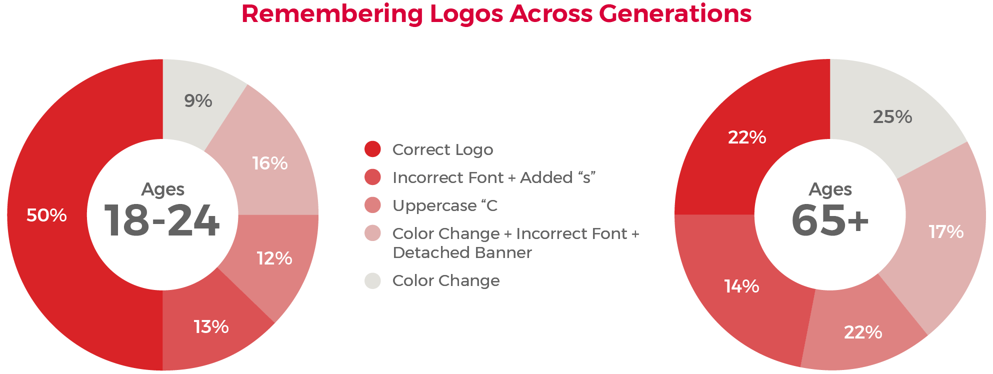
McCormicks attempts to target millennials in their marketing have been successful with half of the 18-24 year olds surveyed recognizing the correct logo compared to Baby Boomers and the Silent Generation who only chose correctly one-fourth of the time.
McCormick has dominated the spice industry for years, but regardless of their status as a monopoly, they haven't been afraid of adapting to change. Understanding the importance of millennial consumers is crucial for many businesses. It's easy to see that their efforts to target younger generations have paid off with nearly 2 million likes on Facebook and millennials being most likely to recognize the correct logo.
Mrs. Butterworth's
Mrs. Butterworth made her television debut in 1961 and soon became a household favorite with her distinct thick, rich and buttery syrup. Over the years, she has covered the sticky hands of children, been a breakfast staple and appeared in a variety of GEICO commercials. Not much has changed about Mrs. Butterworth's matronly shaped bottle and red label, but how easy is it to remember the details of her logo beyond that?
The shift from glass bottles to plastic was a big factor in the Mrs. Butterworth evolution. Changing the packaging gave more surface space for a redesigned logo that no longer included solely text. The millennium brought about her new look that she has consistently maintained since.
Although she has never been particularly computer savvy and doesn't exactly have a strong social presence compared to some of the other brands on this list, Mrs. Butterworth's doesn't go unrecognized. Men and women of all ages love her and the majority were able to pick out her correct logo among the variations we presented. Here's how the responses stacked up.
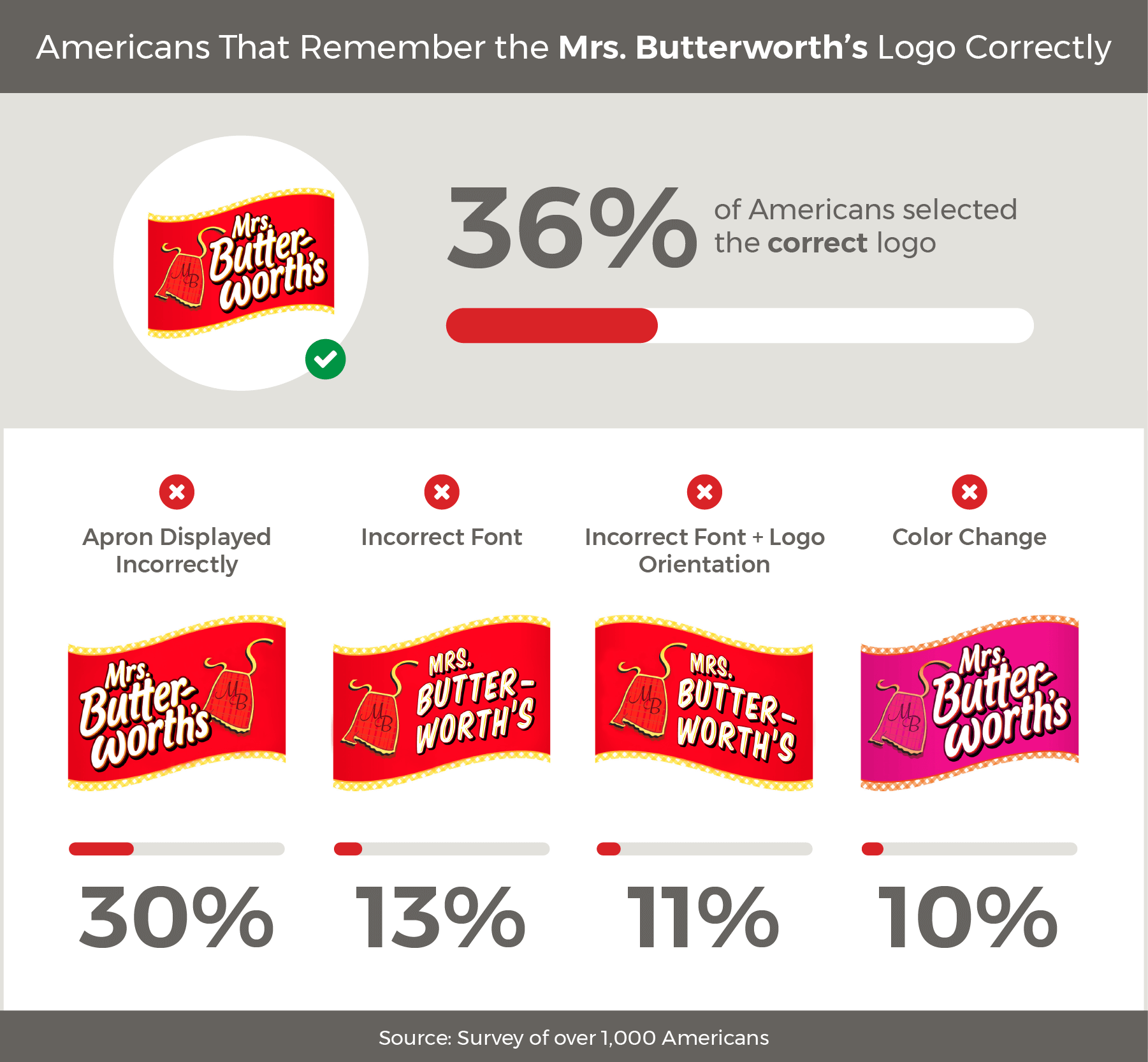
Not many people, regardless of demographic, seemed to remember which side of the logo was home to the Mrs. Butterworth's apron with similar responses between the right side placement of our design and the real logo where the aprons sits left. Interestingly enough, women ages 25 to 34 were twice as likely to choose the incorrect placement compared to women ages 18 to 24.
Our redesigned Mrs. Butterworth's logo may compete with the real thing, but most consumers can't be fooled when it comes to their favorite syrup brand. Seems like years of pancakes, waffles and Mrs. Butterworth have not only put us into sugar overload, but also imprinted this logo in memory.
Tree Top
From applesauce to mango juice, the Tree Top brand can be found in several aisles of the grocery store and lives in the refrigerators and kitchen cabinets of just about any household with children. It has kept up with demand and redesigned its packaging to provide mom's with a peace mind when it comes to what they slip into their kid's lunch boxes.
While Tree Top is a relatively new brand compared to others on this list, founded in 1960, the logo has still seen a bit of redesign over its short lifespan. Its look has included everything from a simple kids text logo, to a design that represents its grower owned roots that make consumers feel as if they purchased their apples straight from the orchard.
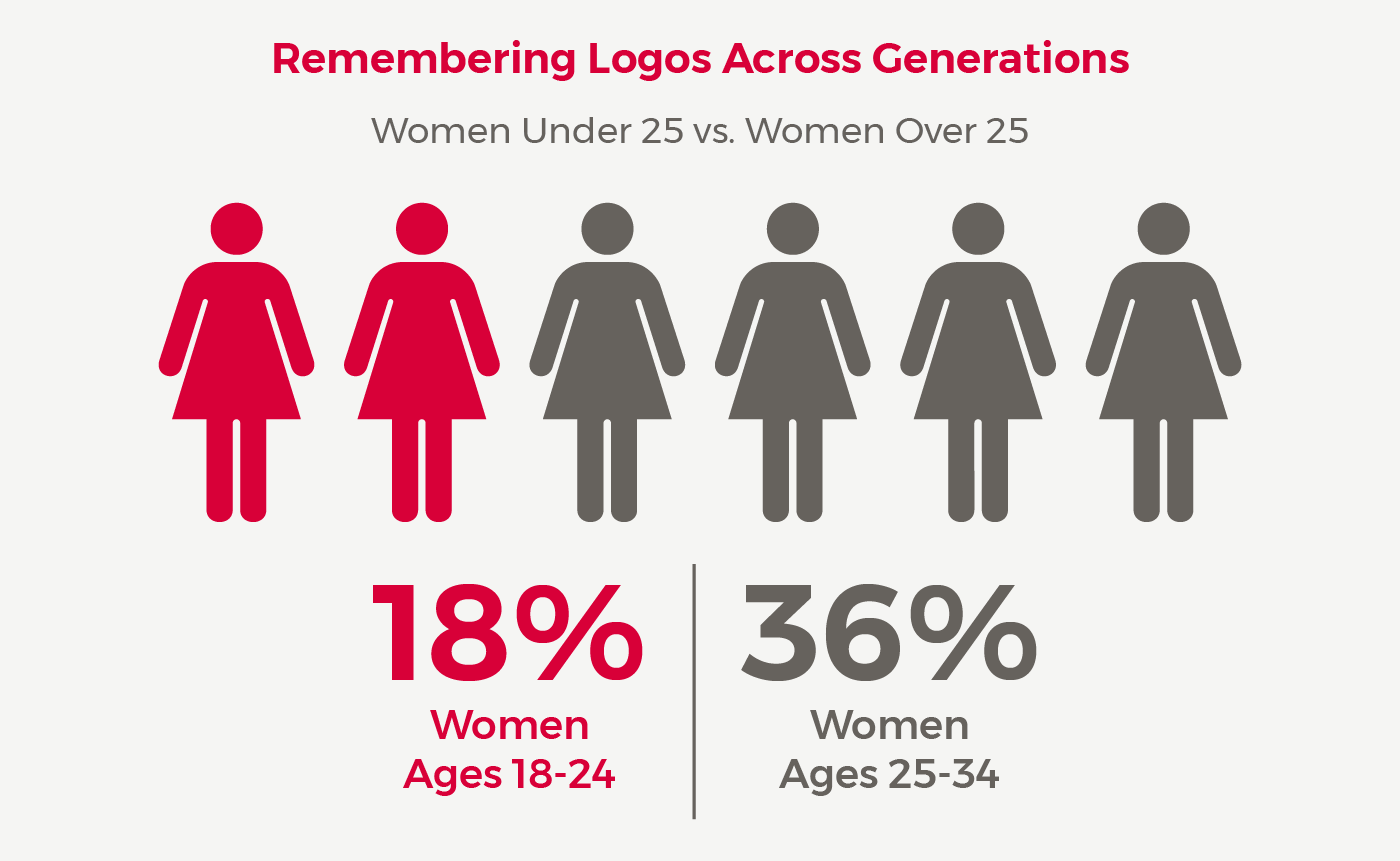
How did this brand fare in the logo challenge? Just like the others surveyed, we were interested to find out what details were most recognizable. To our surprise, the responses varied more than the other brands with only one-fourth of the individuals surveyed choosing the logo correctly. Others recognized our variation with italicized font and the plain text logo minus its lush surroundings.
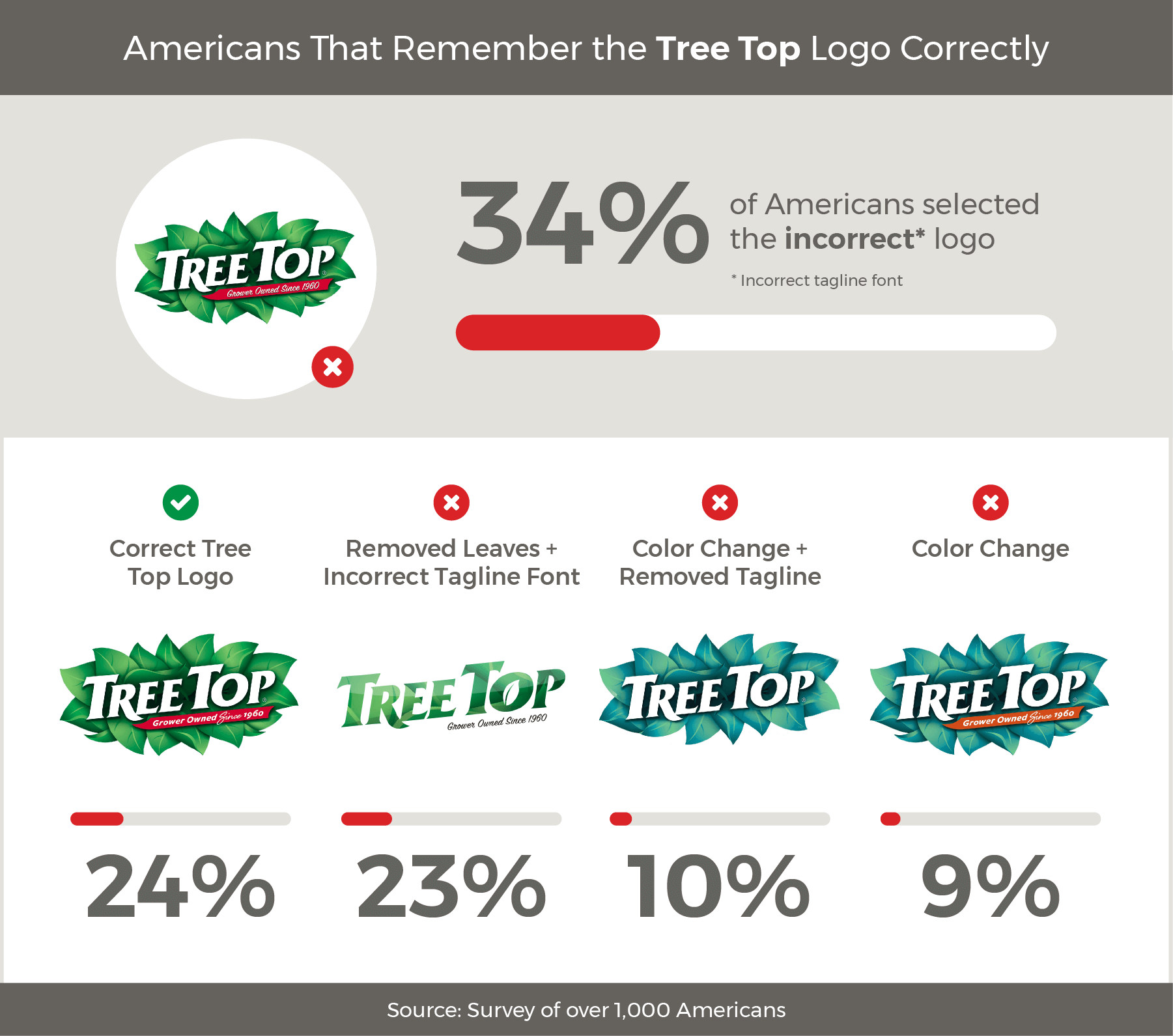
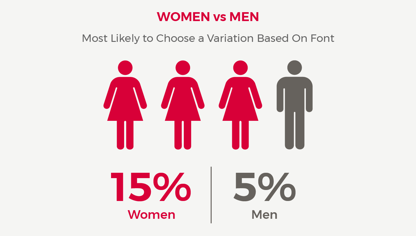
While these font variations are a minor change, it was surprising to find that both women and men selected an alternative font option over the correct logo at 37 percent and 31 percent. While our redesigned color version was the least recognized, the 55 to 64 age group showed interesting results where women were three times more likely to choose this version compared to men.
Surveyees across the board seemed to make more mistakes with the Tree Top logo choosing our font variation first, followed by the real leafy logo and, interestingly enough, a plain text logo. Perhaps it's the brands young age and logo evolution that plays a role in the lack of recognition. Regardless, this kitchen cabinet staple wasn't easily remembered in our survey.
Summary
To recap, does branding stick?
Based on our study, this seems to be the general consensus for household brands who have built trust over the years. The results show that the majority of Americans remember brand logos despite changes in font, color and small details. Of course there are a variety of reasons certain demographics may sway otherwise. This is often the case when companies have experienced rebranding or a series of logo changes over the years. On average, millennials may have a better time recalling a logo if the brand is younger or has targeted youth in their advertising, while older demographics may remember a brand with stronger roots. This was the case with Arm & Hammer, where women over the age of 65 remembered the brand for its bicarbonate soda product—likely because it was marketed to wives and mothers during the mid-century when more women were full-time homemakers. It's important to remember that the way a brand positions a product can determine how it is remembered in the eyes of consumers for decades to come.
Methodology:
We redesigned eight different popular household logos and created four alternative variations of each to compare with the brand's real logo. Through the process, we surveyed 1,000 individuals per brand to see what people remembered most about these iconic American logos: color, design detail and font. The results took into account the number of responses, age and gender for each brand.
Fair Use Statement:
Want to use this study? Give credit where credit is due—our findings are free to use for non-commercial purposes. We simply ask that you link to this page and attribute Kitchen Cabinet Kings appropriately.